
TikTok Ad Specs Complete Guide for High Impact Ads

The usual TikTok ad specs problem doesn't start in Ads Manager. It starts three days earlier, when creative signs off on a cut that looks clean in Premiere, legal approves the on-screen copy, and then media tries to upload it only to find the framing feels wrong, the CTA lands under interface chrome, or the asset fits one placement but not the others you bought.
That's why I treat TikTok ad specs as production constraints, not a formatting checklist. If your team builds around those constraints early, you can produce one strong vertical master, create deliberate cutdowns, and ship assets that survive real delivery conditions instead of just passing an internal review. The same discipline matters whether you're running direct response, creator-led Spark, or a premium takeover.
For teams dealing with business audiences, the production logic is the same even if the messaging is different. TikTok still rewards native, mobile-first execution, which is why the same vertical-first planning used in consumer campaigns also applies to TikTok for B2B brands.
Table of Contents
Introduction to TikTok Ad Specs and Why Precision Matters - Where teams usually lose time - What precision actually buys you
How TikTok Ad Formats Are Organized - Auction In-Feed - Spark Ads - TopView - Reservation and Branded solutions - How to choose the right build approach
Universal Video Foundations for Every TikTok Ad - Start with the master canvas - File handling that keeps assets usable - The production takeaway
In-Feed and Spark Ads Specifications in Detail - What applies to standard In-Feed - What actually works in production - How Spark changes the workflow - Reframing a 9:16 master for secondary variants
TopView and Reservation Ad Specifications in Detail - Why premium placements need their own edit logic - How to build the right cutdowns - Frame rate and duration checks that prevent bad surprises - What to keep from the master and what to rebuild
Branded Hashtag Challenge and Branded Effects Specifications - Branded Hashtag Challenge production logic - Branded Effects need a different asset stack - Keep one visual system across the campaign
Safe Zones Cropping and UI Overlays You Must Design Around - Safe zones are an editing discipline - What usually gets covered - A practical review process for overlays - The rule that saves the most rework
Quick Reference Table for All TikTok Ad Specs - TikTok Ad Specs at a Glance - How to use the table without oversimplifying
Upload Tips Templates and Pre Flight Checklist - A simple upload workflow that holds up - Pre-flight checklist - Templates worth keeping on hand
Introduction to TikTok Ad Specs and Why Precision Matters
A lot of teams still treat TikTok specs like the last row in a production brief. Aspect ratio, duration, file size, done. That's backwards.
TikTok's in-feed ad system is built around a vertical 9:16 canvas, with a published minimum vertical resolution of 540 × 960 pixels, while in-feed inventory also accepts 16:9 at 960 × 540 and 1:1 at 640 × 640. For non-Spark auction in-feed ads, TikTok allows videos up to 10 minutes and files up to 500 MB, while TopView runs 5 to 60 seconds and also supports up to 500 MB according to TikTok ad specs and sizes guidance.
Those aren't just numbers for trafficking. They shape the entire asset pipeline. They affect how you shoot, how much headroom you leave, whether your editor can crop a square variant without killing the composition, and whether your producer asks for alternate endings before the set is struck.
Where teams usually lose time
The most common failures are predictable:
Landscape-first source footage: The ad technically uploads, but the in-feed presentation feels boxed in and small.
Single-cut thinking: One long version gets forced into placements with very different viewing behavior.
Late reframing: Editors crop after graphics are baked in, so titles and product shots drift into bad positions.
No QA pass for placement rules: Assets get approved creatively, then rejected operationally.
Practical rule: If a campaign is buying more than one TikTok placement, the master asset needs to be planned before the first export, not after the first rejection.
What precision actually buys you
When the build is right, your creative team doesn't have to remake the ad for every buy. You build one vertical-first system: master, cutdowns, overlays, caption variants, and QA checks. Then you adapt with intent.
That matters more now because TikTok's spec history shows a broader, more mature placement mix across Auction In-Feed, TopView, and reservation in-feed ads. The published pattern is consistent: 9:16 vertical as the default, 1080 × 1920 as a preferred export in many guides, and 540 × 960 as the minimum accepted vertical size, while official help still allows 16:9 and 1:1 variants for in-feed placements in some cases via TikTok's auction in-feed documentation.
How TikTok Ad Formats Are Organized
A campaign gets approved on Monday with one polished 9:16 cut. By Wednesday, media adds Spark for creator posts, TopView for launch day, and a branded unit tied to a larger activation. If the team treated TikTok specs as a list of export settings, production scrambles. If the team treated them as placement constraints from the start, the same master can stretch across those buys with planned cutdowns, safe zones, and a clean QA pass.
TikTok formats are easiest to organize by two things: how the inventory is bought, and how the ad appears to the viewer. That framework is more useful than sorting by creative style because similar-looking videos can have very different approval, pacing, and versioning needs once they are trafficked.
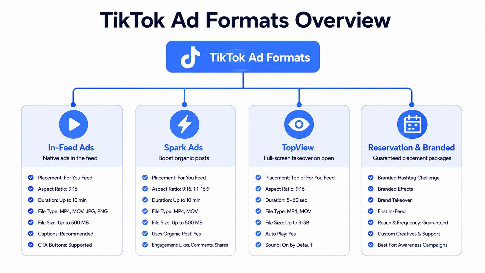
Auction In-Feed
Auction In-Feed is the testing environment for most paid teams. It sits inside the For You feed, carries the least production overhead, and gives buyers room to rotate hooks, offers, captions, and CTAs without rebuilding the campaign structure.
From a production standpoint, a single master earns its keep. Build one vertical source with protected title space, subtitle space, and product framing, then version it into shorter cuts or alternate intros. That same file can support multiple ad groups if the opening beats and text overlays were planned to survive cropping and UI overlap.
Spark Ads
Spark Ads use an existing TikTok post as the ad. That sounds close to In-Feed because it often renders similarly, but the production trade-off is different. The post identity matters. So do the original caption, comments, profile context, and creator permissions.
This is the format where sloppy source control causes problems fast. If the original post has crowded lower-third text, weak opening audio, or a logo tucked into an unsafe area, paid social cannot always repair it in the ad account. Teams that plan for Spark usually build or brief creator content with paid usage in mind on day one, not after the post is live.
TopView
TopView is bought for reach and impact, and it puts more pressure on the first impression than standard feed inventory does. The placement is prominent. Viewers see the opening before scroll behavior has filtered anything out.
That changes the edit. A TopView cut usually needs a cleaner first frame, stronger branding discipline, and tighter pacing control than a feed test asset. In practice, I rarely want to drop a raw In-Feed winner straight into TopView without checking whether the intro lands fast enough and whether text placement stays clear at full-screen scale.
Reservation and Branded solutions
Reservation formats and branded products belong in a separate production bucket because they are tied to larger media commitments and broader campaign mechanics. The asset is often only one component. There may be a hero film, supporting cutdowns, creator handoff files, effect assets, or moderation considerations attached to the same launch.
That is why format planning needs to happen before edit lock. Teams working on scaling TikTok creative workflows usually find the same failure point. Manual versioning works for one or two placements, then breaks when branded, reservation, and creator-led assets all need different approvals and exports.
How to choose the right build approach
Use a production system, not a pile of files.
Start with one 9:16 master when the buy includes In-Feed, Spark, or both. Build it with safe zones, modular text, and enough clean framing to support cutdowns.
Split out dedicated edits for TopView or reserved placements when the opening structure, pacing, or branding treatment needs to work harder.
Plan adaptation before post-production if creators, regional teams, or partners will touch the asset. Lock naming, framing rules, and approved overlay positions early.
Run placement QA by format before upload. A video that looks fine in review can still fail in delivery because the caption area, CTA, or profile UI covers the wrong part of the frame.
Format choice affects more than media setup. It determines how many versions get cut, where approvals bottleneck, and how much launch risk sits with the editor instead of the buyer.
Universal Video Foundations for Every TikTok Ad
Before you get into format-specific nuances, there's a baseline set of standards that should govern almost every TikTok video asset you produce. If these foundations are wrong, the rest of the workflow gets expensive fast.
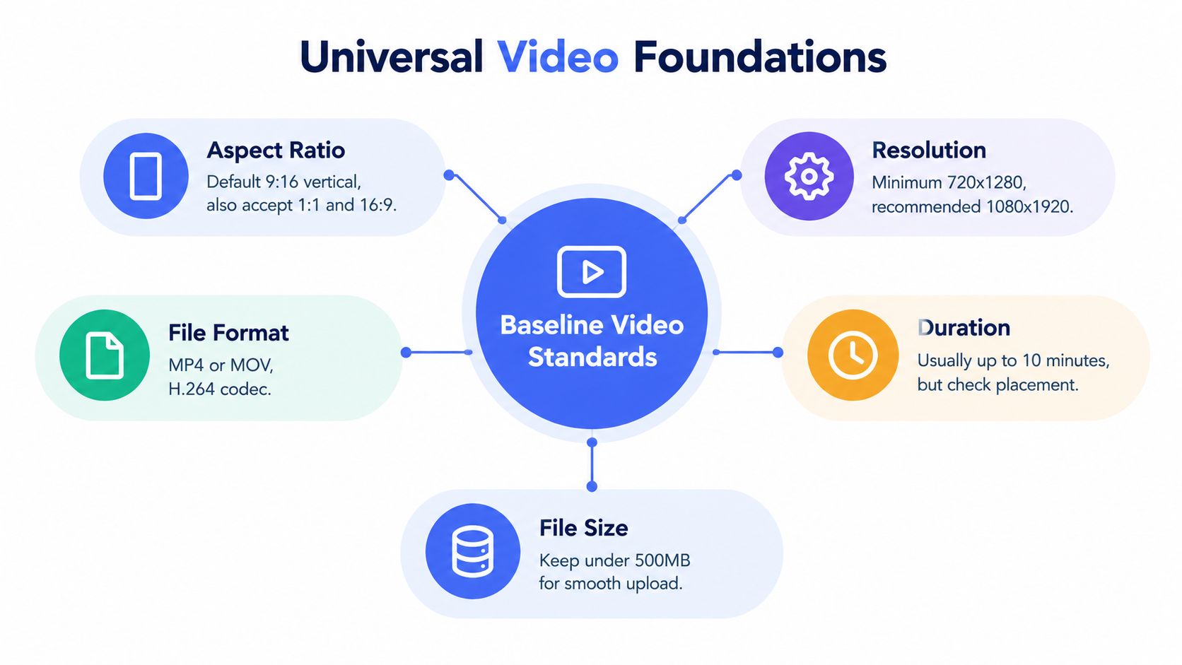
TikTok's durable production standard for in-feed video is vertical 9:16 creative with a minimum resolution of 540 × 960 px and a recommended export of 1080 × 1920 px. TikTok guidance also accepts 16:9 and 1:1 variants in some placements, but vertical remains the native full-screen format that best avoids letterboxing and interface compression according to TikTok's reservation in-feed guidance.
Start with the master canvas
If a team asks me what to build first, the answer is simple. Build a 9:16 master and protect it as the source of truth.
That doesn't mean every placement must stay vertical forever. It means your first approved timeline should assume mobile-first viewing, full-screen use, and interface overlap. A vertical master gives editors room to crop outward for secondary placements. A horizontal-first asset usually forces painful compromises in the opposite direction.
If your team needs a broader mobile creative framework beyond TikTok alone, mobile video advertising principles line up closely with this same vertical-first planning model.
File handling that keeps assets usable
TikTok's preview and spec guidance lists a 500 MB maximum file size and common upload formats including MP4, MOV, MPEG, AVI, and 3GP in TikTok reservation in-feed specs. In practice, that means post teams need to think less about “highest possible quality” and more about efficient delivery quality.
A few production habits help:
Use dependable upload formats: MP4 and MOV are the easiest handoff formats.
Control bitrate intentionally: Don't let exports bloat just because the timeline contains grain, fast cuts, or heavy text animation.
Check actual playback on device: A beautiful desktop preview can still feel muddy after upload if the compression stack is fighting your source file.
Keep source graphics modular: Separate overlays, subtitles, and CTA cards let you remake variants quickly without rebuilding the timeline.
For teams newer to the framing side, this explainer on TikTok aspect ratio explained is a useful companion to the production decisions above.
The production takeaway
Most TikTok ad specs decisions should happen before editing starts.
Use this baseline:
Foundation | Production default |
|---|---|
Master format | 9:16 vertical |
Export target | 1080 × 1920 |
Absolute minimum | 540 × 960 |
Alternate variants | 1:1 and 16:9 when placement allows |
File ceiling | 500 MB |
Common containers | MP4, MOV, MPEG, AVI, 3GP |
That table isn't the whole job, but it keeps the job from going sideways.
In-Feed and Spark Ads Specifications in Detail
In-feed and Spark are where the bulk of a TikTok ad budget and production time goes. They look simple because they appear inside the feed. They're not simple. They're the placements where small spec decisions compound into very visible creative problems.
What applies to standard In-Feed
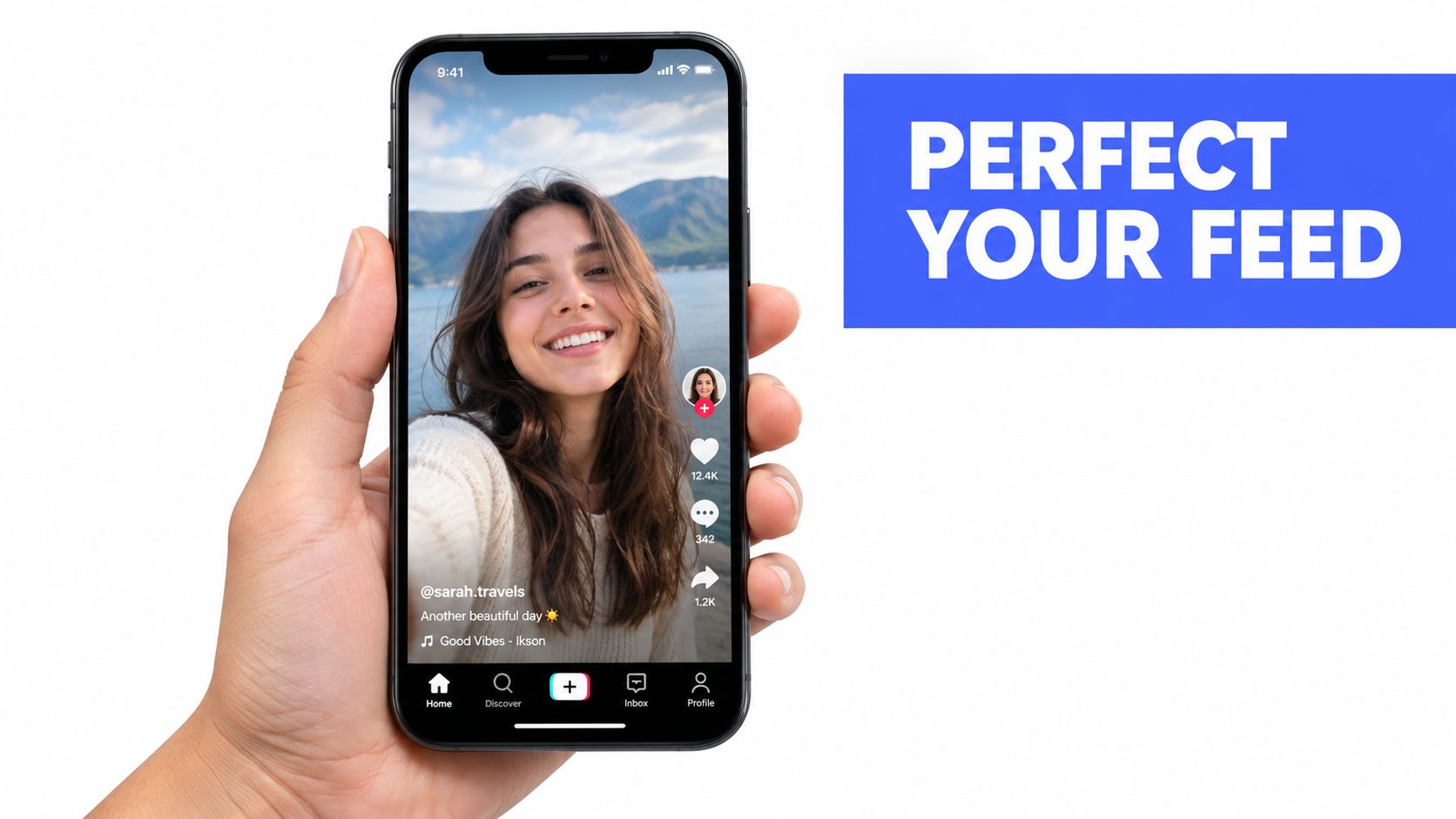
For non-Spark auction in-feed ads, TikTok allows videos up to 10 minutes with files up to 500 MB, and accepts a 9:16 vertical default while also allowing 1:1 and 16:9 variants in some inventory according to TikTok ad specs and sizes guidance.
That long duration ceiling can mislead teams. Just because the placement allows a long video doesn't mean the creative should be built that way. In-feed success usually comes from fast comprehension, clean framing, and an opening that doesn't wait for the viewer to become patient.
What actually works in production
The best in-feed builds usually share the same production pattern:
A native-feeling opening: The ad starts like feed content, not like a polished TV spot dropped into a phone.
A legible focal point: Product, face, or problem statement is obvious immediately.
Text that supports, not crowds, the frame: If the whole message lives in tiny subtitles, the ad is already working too hard.
A modular ending: Swappable CTA endings make testing easier without touching the body of the edit.
Editing note: If the timeline only works with all text burned in at once, it isn't flexible enough for real paid social use.
How Spark changes the workflow
Spark Ads are different because they amplify an existing TikTok post rather than acting like a fully isolated paid asset. That means your production decisions have to account for both the organic post behavior and the paid outcome.
The practical implications are straightforward:
Choose the right source post first. Don't assume every organic post deserves paid support.
Check the frame before boosting. A post that looked fine organically may still have weak title placement, cramped subtitles, or poor brand visibility.
Respect creator composition. Overcorrecting Spark source creative can remove the authenticity that made it usable in the first place.
Here's a useful visual reference on the feed environment and how native-style ads sit inside it.
Reframing a 9:16 master for secondary variants
If a placement mix still requires alternate ratios, don't redesign from scratch unless the composition breaks. Start from the vertical master and adapt.
1:1 square variant
Square works when the subject is centered and text is already compact. It fails when your original layout relies on vertical breathing room. Editors often discover too late that the product shot was framed beautifully for a tall canvas but feels cramped the second the top and bottom are removed.
16:9 horizontal variant
Horizontal is the hardest rescue job. It can work for product demos, software captures, and some motion graphics sequences, but creator-led selfie framing often doesn't translate well. If you know a horizontal variant is needed, shoot with extra lateral room from the start.
Export discipline
A good handoff package for In-Feed and Spark usually includes:
Master vertical version
Short cutdown
Alternate ending
Clean textless source
Platform-ready upload file
Caption and naming notes for trafficking
That package keeps the paid team from inventing workarounds in the final hour.
TopView and Reservation Ad Specifications in Detail
TopView and reservation placements look glamorous in media plans, but they demand stricter discipline than standard feed ads. You get visibility, but you also lose the margin for lazy pacing.
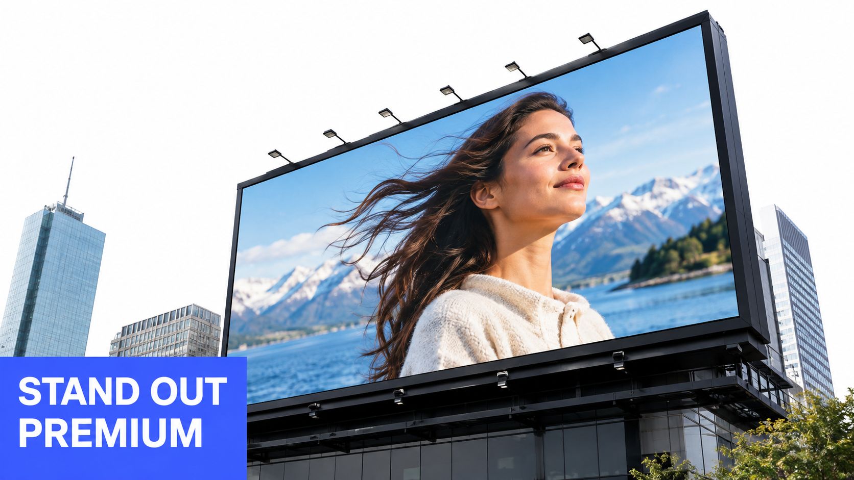
TikTok's TopView format is specified at 5 to 60 seconds, with 9 to 15 seconds recommended, and the same guidance also notes video package placements that call for durations under 16 seconds and a frame rate at or below 30 fps for certain packaged executions in TikTok reservation TopView requirements.
Why premium placements need their own edit logic
A lot of teams assume a premium placement can carry a standard in-feed ad because the environment is more prominent. Usually the opposite is true.
TopView exposes weak intros immediately. Slow builds, logo-first animations, and overlong setup sequences feel even more awkward when the ad arrives with high visibility. First-second payoff matters most. The viewer needs a reason to stay before the creative asks for anything.
How to build the right cutdowns
For production teams, this placement is less about one “hero cut” and more about a small family of deliberate versions.
Reach-efficient version: Use a concise cut designed for immediate message delivery. This is often the cleanest use of the placement.
Expanded explanation version: Use a longer variant only when the product needs sequence and context.
Compliance version: Keep one export that has already been checked for duration, frame rate, and file-size compatibility before trafficking.
Premium inventory doesn't forgive ambiguity. If the idea needs too much setup, it belongs in a different placement or a different edit.
Frame rate and duration checks that prevent bad surprises
Reservation workflows tend to break on operational details, not creative ambition. A few recurring mistakes cause most headaches:
QA risk | What happens |
|---|---|
Wrong duration for package | Asset gets rejected or swapped late |
Frame rate mismatch | Delivery issue or re-export scramble |
Oversized file | Upload delay or unnecessary compression |
Inherited in-feed ending card | Premium placement feels tacked together |
What to keep from the master and what to rebuild
You can still start with the same campaign master, but don't assume you'll finish there.
Keep these from the original build:
Core footage
Primary messaging
Brand visual system
Rebuild these for TopView and reservation use:
Opening beat
Pacing
Ending structure
Audio timing if the cut relies on sound cues
Another practical point: recent coverage keeps repeating the familiar “9:16 vertical, 1080 × 1920, 5 to 60 seconds” guidance, but also notes that spec-compliant creative isn't automatically effective. It highlights that 1:1 and 16:9 may still be accepted in some placements while often underperforming, and that the practical sweet spot is usually 9 to 15 seconds, with emphasis on retention and UI-safe framing in this review of TikTok ad specs and benchmarks.
That's the right way to think about premium TikTok ad specs. Compatibility gets you uploaded. Intentional editing gets you watched.
Branded Hashtag Challenge and Branded Effects Specifications
Branded Hashtag Challenge and Branded Effects sit outside the usual “upload a video and run it” workflow. They're campaign systems, not just ad files.
That changes the producer's job. Instead of delivering one finished asset, you're often coordinating a hero video, supporting variants, visual identity rules, creator usage expectations, and sometimes a feed amplification plan around the branded experience.
Branded Hashtag Challenge production logic
The central asset in a hashtag challenge still needs to behave like a strong TikTok video. It has to feel native, legible, and easy to imitate. If the idea is too polished to copy, participation usually gets harder.
In practical terms, teams should build around:
A clear action to replicate
A visible product or behavior cue
Simple on-screen instruction
A visual rhythm creators can borrow without needing the exact same tools
The challenge video should also align visually with the feed units that support it. If the paid In-Feed ads and the challenge hub feel like different campaigns, users notice.
Branded Effects need a different asset stack
Branded Effects introduce another layer. The effect itself becomes part of the creative system, so the video isn't the only deliverable that matters. Producers need a handoff process for effect assets, visual references, naming, and testing.
That usually means coordinating:
The effect concept and visual behavior
The hero video showing it in use
Creator guidance or example usage
Paid support assets that drive people into the experience
A branded effect isn't just a design object. It's a usability object. If people don't understand it instantly, the campaign loses momentum.
Keep one visual system across the campaign
The best branded TikTok programs don't reinvent themselves from placement to placement. They carry one visual system across all parts of the launch.
That means:
the challenge video should feel related to the paid support,
the effect demo should look intentional inside the same campaign world,
and any supporting TopView or In-Feed edit should preserve recognizable framing, product use, and message order.
A vertical master still helps. Even if the branded activation has custom components, the core footage and message architecture should stay reusable. That saves editorial time and makes the campaign feel coherent instead of stitched together.
Safe Zones Cropping and UI Overlays You Must Design Around
A TikTok ad can be fully spec-compliant and still fail visually. That usually happens when critical text, logos, or CTA language lands where the interface lives.
The platform's visible UI competes with your creative. Profile elements, engagement icons, captions, and lower-screen clutter all fight for the same real estate. So the job isn't just matching TikTok ad specs. It's preserving message clarity after the interface takes its share of the screen.
Safe zones are an editing discipline
Editors should think in two layers:
Title-safe thinking: Keep the core message away from edges and likely overlay zones.
Action-safe thinking: Protect the product shot, price frame, or CTA cue from the parts of the interface users are most likely to notice first.
This becomes even more important when teams adapt assets across ratios. Vertical framing gives you more stacking room. Square removes top and bottom freedom. Horizontal often forces a complete redistribution of text and graphic weight.
If your team works across multiple vertical-first placements, vertical video for mobile advertising is the broader discipline behind these safe-zone choices.
What usually gets covered
The most common layout mistakes are easy to spot once you know where to look:
Bottom-heavy subtitles: The feed UI competes with them immediately.
CTA cards too low in frame: The action cue sits where the interface already has visual priority.
Tall headline stacks: They look fine in the edit bay but collapse once profile and caption elements appear.
Corner logos: These often survive desktop review and then feel cramped on device.
A practical review process for overlays
Before export, run a simple visual QA pass on every version.
Check one
Scrub the full edit on a phone-sized preview and look only at text placement. Ignore the story. If text feels crowded, the viewer will feel it too.
Check two
Pause at the opening frame, midpoint, and CTA beat. Make sure the key subject remains readable even if a viewer never turns on sound.
Check three
Test any square or horizontal reframes separately. Don't assume a safe vertical layout remains safe once the crop changes.
If your headline, product, and CTA all need the same part of the screen, the layout isn't solved yet.
The rule that saves the most rework
Don't place irreplaceable information in any area that might share attention with native UI.
That means logos can move, decorative text can shrink, and secondary badges can disappear. The message cannot. Producers who separate those priorities early end up with assets that survive both trafficking and actual viewing.
Quick Reference Table for All TikTok Ad Specs
This is the matrix I'd keep open during planning, editing, and final QA. It's not a substitute for judgment, but it's the fastest way to catch obvious mismatches before they become launch-day problems.
TikTok Ad Specs at a Glance
Ad Format | Aspect Ratio | Resolution | Duration | Max File Size |
|---|---|---|---|---|
In-Feed Ads | 9:16 default, 1:1 and 16:9 accepted in some placements | 540 × 960 minimum vertical, 1080 × 1920 commonly preferred export | Up to 10 minutes for non-Spark auction in-feed | 500 MB |
Spark Ads | Typically built from TikTok post creative, usually best from 9:16 source | Use the same vertical-first production standards as your source asset | Depends on the source post and campaign setup | Not separately specified here |
TopView | 9:16 | Use vertical production standards aligned to TikTok guidance | 5 to 60 seconds, with 9 to 15 seconds recommended | 500 MB |
Reservation In-Feed | 9:16 default, with some alternate orientation support depending on placement | Use vertical-first export planning | Video package guidance calls for under 16 seconds in certain packaged placements | 500 MB where specified in related guidance |
Branded Hashtag Challenge | Build around 9:16 hero video logic | Use the same vertical-safe source planning as other TikTok video units | Varies by campaign structure | Not separately specified here |
Branded Effects | Effect-led campaign assets rather than one standard video rule | Depends on effect asset package and supporting video creative | Varies by campaign structure | Not separately specified here |
How to use the table without oversimplifying
A few cautions matter:
Compatibility isn't the same as performance. A format may accept an orientation that still looks weaker in-feed.
Duration ceilings aren't creative recommendations. A long allowance only tells you what can upload.
Some branded formats require custom planning. Treat them as campaign systems, not as one more box in the export menu.
For producers and media buyers, this table is most useful at three moments:
Before shoot planning
Before versioning starts
Right before trafficking
That cadence catches most preventable mistakes while there's still time to fix them.
Upload Tips Templates and Pre Flight Checklist
The last mile is where a lot of solid TikTok creative gets damaged. Not because the idea is bad. Because nobody owned the handoff.
A simple upload workflow that holds up
Use one folder per campaign with a clear split between master files, platform exports, cutdowns, and trafficking-ready finals. Keep naming obvious enough that a media buyer can identify the right asset without opening five nearly identical files.
For post teams using creator-led or simplified production approaches, these ClipNova faceless video insights are useful for thinking about scalable social formats, especially when the campaign mix includes direct response iterations and lighter-turnaround variants.
Pre-flight checklist
Run this check before anything gets uploaded:
Resolution check: Confirm the export matches the intended placement.
Ratio check: Verify the file is the correct orientation, not just a cropped duplicate.
Duration check: Match the cut to the placement rule and buying plan.
File size check: Keep the export within the allowed ceiling.
Safe-zone check: Review text, logos, and CTA placement against likely UI overlays.
Audio and subtitle check: Make sure the ad still communicates with sound low or off.
Final playback check: Watch the actual export on a phone before trafficking.
Templates worth keeping on hand
The most useful recurring templates are:
9:16 master timeline
Square adaptation timeline
Horizontal rescue timeline
CTA end-card modules
Subtitle-safe overlay guides
One practical option for teams producing these kinds of vertical masters and platform adaptations is Busylike, which offers vertical video and mobile ad production aligned to TikTok-style delivery needs.
If your team needs help turning TikTok ad specs into an actual production system, Busylike handles the pieces that usually break under pressure: vertical-first creative, paid social cutdowns, creator-ready variants, and trafficking-safe exports. Visit Busylike to see how the team supports brands that need TikTok creative built correctly the first time.

