
YouTube Advertising Specs: The Complete Reference Guide

A reliable YouTube advertising setup starts with one 1080p master and branches into 16:9, 9:16, and 1:1 variants at 1920 × 1080, 1080 × 1920, and 1080 × 1080. From there, build format-specific edits for skippable, non-skippable, bumper, Shorts, in-feed, and companion placements rather than forcing one file to do every job.
The production problem usually appears late. Media has been approved, the editor has delivered a polished horizontal film, and then the campaign expands into Shorts, in-feed surfaces, or connected-TV-adjacent inventory. The logo is cropped, the offer sits beneath interface controls, the vertical version relies on an upscale, and the six-second cut tries to explain an entire product. YouTube advertising specs aren't a final upload checklist. They're an asset-management system that should shape the campaign before anyone starts exporting files.
Table of Contents
Understanding YouTube Ad Formats and Placements - Build the placement map before the edit
Resolution and Aspect Ratio Standards for YouTube Video Ads - Use one master, then protect each branch - Treat resolution as a media decision
Creative Best Practices for Different YouTube Ad Placements - Edit for the viewer's decision
Video Length and Duration Requirements by Ad Type - Map duration to the job - Design the first and last frames
Companion Banners and In-Feed Video Ad Specifications - Separate the supporting assets
Understanding YouTube Ad Formats and Placements
A team can follow every pixel requirement and still produce the wrong asset. The reason is simple: YouTube doesn't have one advertising surface with one viewing behavior. It has an ecosystem that includes skippable in-stream ads, non-skippable in-stream ads, in-feed video ads, bumper ads, masthead ads, Shorts ads, and audio ads, each placing different demands on the edit, framing, and call to action. Google's official format documentation describes these units across inventory categories such as in-stream and out-stream, which makes placement part of the specification rather than a separate media detail. Google's YouTube ad-format documentation is the useful starting point for mapping those environments.
Consider a campaign built around a product demonstration. A skippable in-stream version needs to earn attention before the viewer can leave. An in-feed version needs a thumbnail and title that earn the click before playback begins. A Shorts version needs vertical composition and immediate movement, while an audio placement must carry the message without relying on visual proof. The campaign idea can remain consistent, but the delivery logic can't.
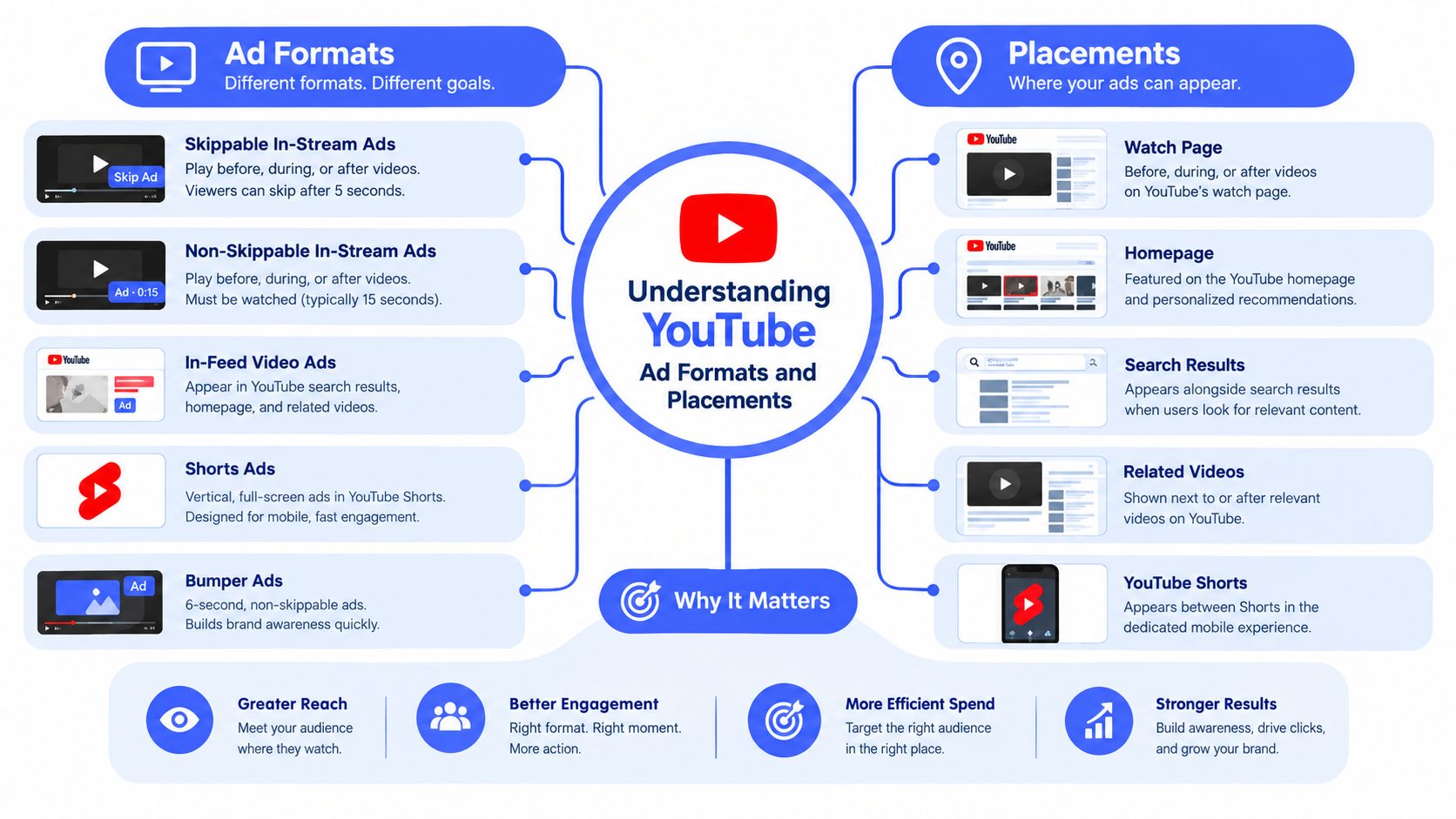
Build the placement map before the edit
A useful planning document has three layers:
Surface: Identify whether the asset appears in a watch experience, a browse feed, Shorts, audio inventory, or a larger promotional placement.
Behavior: Record whether the viewer can skip, swipes away, clicks to watch, or receives the message without video.
Asset branch: Assign the required orientation, duration, captions, end card, thumbnail, and safe-area treatment.
This prevents a common production mistake, which is treating a master file as a universal deliverable. The master should preserve the strongest footage and cleanest composition. The branches should adapt the message to the behavior of each placement.
Planning rule: Choose the placement and viewer action first. Choose the export settings second.
The same logic applies when YouTube sits beside CTV and paid social. A high-quality master can support multiple downstream versions, but only if the original composition leaves room for reframing and the production team maintains organized source files. Specs are therefore a navigation tool. They tell you what the platform can accept, but placement behavior tells you what the viewer is likely to notice.
Resolution and Aspect Ratio Standards for YouTube Video Ads
Google supports three central creative orientations for YouTube video ads: 16:9 horizontal, 9:16 vertical, and 1:1 square. Its recommended target is 1080p Full HD, with exact dimensions of 1920 × 1080, 1080 × 1920, and 1080 × 1080, respectively. The official Google Ads video specifications also list lower HD minimums and allow files up to 256 GB, while noting that SD isn't recommended for optimal quality.
Those numbers should influence the workflow, not just the export panel. Start from a 1080p source whenever possible, then derive the other orientations from the original edit. Upscaling a low-resolution horizontal file won't restore missing detail, and it often makes text, product edges, and fine interface elements look soft after additional cropping or compression.
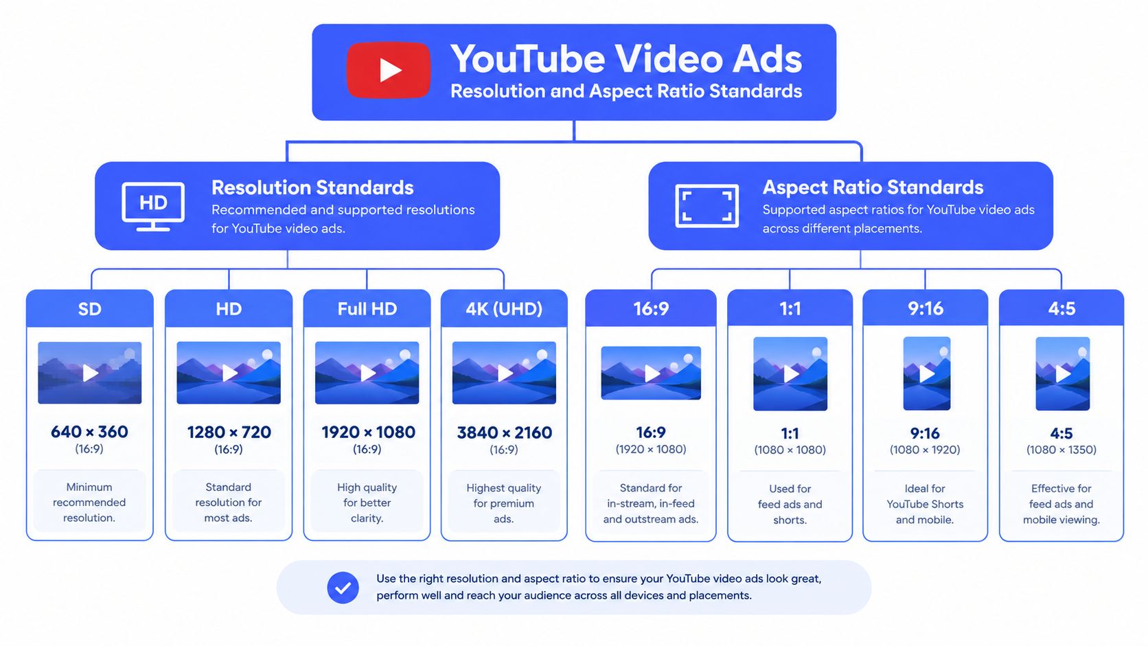
Use one master, then protect each branch
A practical asset matrix looks like this:
Orientation | Recommended dimensions | Typical use |
|---|---|---|
Horizontal, 16:9 | 1920 × 1080 | In-stream, watch-page, larger screens |
Vertical, 9:16 | 1080 × 1920 | Shorts and mobile-first placements |
Square, 1:1 | 1080 × 1080 | Flexible feed and partner contexts |
The master should be composed with a clear subject, readable brand treatment, and footage that can survive a tighter crop. Keep critical copy and product details away from the edges, but don't assume a fixed “safe” percentage will apply across every interface. YouTube, social feeds, and CTV surfaces can add different controls or overlays, so review actual previews rather than relying only on a design grid.
Treat resolution as a media decision
The highest-quality version gives media teams more options. A 1080p horizontal source can support a watch-page cut, while a separately framed vertical version can serve mobile-first inventory without making the campaign look like a cropped television commercial. A square branch can fill a different feed context without forcing the media plan to exclude useful placements.
The trade-off is production time. Automatic reframing is useful for a first pass, but it shouldn't replace an editor's review. Faces, product demonstrations, on-screen comparisons, and interface recordings often need different crops, pacing, or text placement in each orientation.
The following video offers another visual reference for planning YouTube video dimensions and delivery choices.
Creative Best Practices for Different YouTube Ad Placements
Technical compliance won't rescue an edit that hides the brand until the end. For most in-stream work, the opening five seconds are the first major decision window because skippable ads can be skipped after that point. Google's video-ad requirements for campaign assets make that timing operationally important, not merely a creative preference.
Open with the product, outcome, problem, or visual tension. Don't spend the opening on a logo animation that communicates little, and don't make the viewer wait through a scenic setup before explaining why the ad matters. The first beat should still feel like the beginning of a story, but it must also work as a self-contained reason to continue.
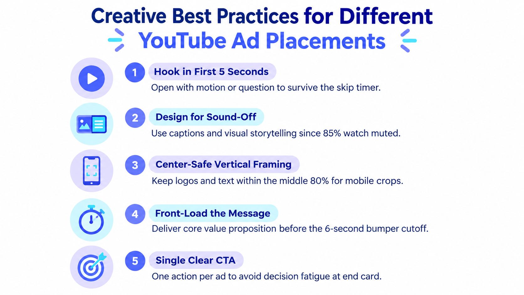
Edit for the viewer's decision
Different placements require different priorities:
Skippable in-stream: Put the central promise and recognizable brand cues up front. Later sections can add proof, demonstrations, or objections for viewers who continue.
Non-skippable in-stream: Remove setup that depends on patience. The viewer will receive the full sequence, so every shot must move the message forward.
Bumper: Build around one thought, one visual payoff, and one memorable brand signal. A compressed long-form commercial usually feels rushed.
Shorts: Frame vertically from the beginning, use captions where speech carries meaning, and make the first visual native to a swipe-driven feed.
In-feed: Treat the thumbnail, title, and opening frame as a single package. The click happens before the viewer commits to the video.
Subtitles and visual explanation help when sound isn't available or isn't being used. They also force the script and edit to communicate more clearly, which is valuable even when audio is on. Keep text large enough for the smallest intended screen and check that it isn't covered by platform controls.
For teams managing multiple versions, YouTube ads management is useful context for connecting media setup with creative versioning. The operational point is straightforward: someone needs ownership of the relationship between placement, asset, audience, and objective.
Editing test: Watch the first five seconds with the sound muted and the brand hidden. If the viewer can't identify the problem, product, or promised outcome, the opening needs work.
A single clear action usually beats a crowded end card. Whether the goal is to learn, shop, sign up, or visit a site, make the requested behavior obvious and give the viewer enough context to understand why it follows from the ad.
Video Length and Duration Requirements by Ad Type
A single 1080p master can support several YouTube placements, but duration determines how that master should branch. Skippable in-stream ads can start at 7 seconds and become skippable after 5 seconds, while bumper ads are non-skippable and capped at 6 seconds. Non-skippable in-stream formats generally allow shorter durations, and 30-second assets require horizontal orientation under the relevant format rules. Confirm the current delivery requirements in Google's video campaign asset guidance whenever the campaign type or placement mix changes.
Cutdowns should be designed, not mechanically trimmed. A six-second bumper needs one idea, a fast product reveal, a concise benefit, and a recognizable brand signal. A longer skippable unit can establish a problem, demonstrate the solution, and provide proof, but its opening must communicate value before the viewer chooses to skip. This asset-management approach preserves a usable master while giving each placement an edit built for its delivery behavior.
Map duration to the job
Use a length architecture that connects each cut to a campaign role:
Six seconds: Reach, repetition, recall, or a single offer.
Fifteen to thirty seconds: Consideration, demonstration, objection handling, or a direct response message.
Longer assets: Discovery and deeper engagement when the selected YouTube campaign and placement support them.
Short cuts also affect reporting and delivery. Videos under 10 seconds may not increment view counts on skippable in-stream inventory, and assets shorter than 10 seconds can be ineligible for in-stream delivery in Video Reach campaigns. Confirm eligibility in the campaign setup before labeling a cut, then measure the action it was built to generate rather than treating it as a miniature version of the long-form film.
Design the first and last frames
The first frame must survive the transition into playback, especially when the same master is adapted across placements. Put the product, problem, or brand signal early enough to remain useful if the viewer skips. The final frame should stay legible long enough to support the intended action, without relying on every viewer reaching it. For non-skippable units, use the guaranteed sequence for a compact narrative, not decorative pauses.
Skippable vs Non-Skippable In-Stream Ads Compared
Skippable and non-skippable in-stream ads solve different attention problems. Skippable inventory gives the viewer control after the opening window, so the creative must earn continuation. Non-skippable inventory gives the advertiser more control over sequence, but weak pacing becomes impossible for the viewer to escape and easy for the audience to resent.
Dimension | Skippable In-Stream | Non-Skippable In-Stream |
|---|---|---|
Viewer control | The viewer can skip after the initial decision window | The viewer watches the required sequence |
Creative priority | Hook, brand recognition, and value proposition early | Tight narrative control from the first frame |
Best fit | Awareness with room for consideration or action | A concise message that must land end-to-end |
Main trade-off | Strong openings are essential because continuation isn't guaranteed | Every unnecessary beat increases perceived interruption |
Production approach | Build a strong opening, then layer proof | Remove setup and protect message density |
Use skippable ads when the campaign benefits from a longer argument, product demonstration, or self-selected engagement. Use non-skippable units when a short, controlled message matters more than giving the viewer a choice to continue. Mixing them can make sense when the campaign needs both broad exposure and a deeper route for interested viewers, but the creative should be edited for each role rather than duplicated across placements.
The decision shouldn't be based on the label alone. Audience familiarity, message complexity, landing-page action, and available footage all affect the right mix. A simple offer may need only a brief non-skippable statement, while a technical product may require a skippable opening followed by proof for viewers who stay.
Bumper Ads, Shorts Ads, and Video Action Campaign Specs
Bumper ads are built for brief, non-skippable exposure and have a hard 6-second ceiling. That limitation is useful when the message is already simple, such as a brand reminder, product cue, or campaign line. It becomes destructive when the team tries to fit a problem, explanation, proof point, and call to action into one compressed edit.
Shorts requires a different production instinct. The native orientation is 9:16, so the vertical branch should be composed intentionally rather than created by placing a horizontal commercial inside a phone-shaped crop. Put the subject in a strong central frame, keep captions readable, and let the opening image communicate the payoff quickly. Swiping is the defining behavior, so a slow intro has little chance to recover.
Video action campaigns require another distinction. The creative needs to support a response, not just recognition. Make the offer or next step easy to understand, connect the promise to the landing page, and avoid an end card that introduces a new idea after the viewer has already decided whether the ad is relevant.
Format | Creative implication |
|---|---|
Bumper | One message, immediate recognition, no unnecessary setup |
Shorts | Vertical-native framing, rapid entry, readable captions |
Video action | Clear response path, aligned landing page, direct value proposition |
In-feed | Strong packaging before playback, persuasive thumbnail and title |
The branches can share the same campaign idea, visual identity, and core proof. They shouldn't share the same pacing by default. YouTube Shorts marketing guidance provides useful context for planning vertical-first content, but the final decision should come from the placement behavior and campaign objective.
Companion Banners and In-Feed Video Ad Specifications
Companion banners and in-feed video ads belong in the asset plan, but they shouldn't inherit assumptions from in-stream video. A companion banner acts as a visual anchor alongside or around video playback, so it needs its own layout, readable text, and brand hierarchy. Its job isn't to repeat every frame of the video. It should reinforce recognition and provide a useful secondary route to the brand.
In-feed video ads work differently again. They appear in browsing environments such as the Home feed, search results, and related viewing surfaces, where the user chooses whether to start the video. The thumbnail, title, and opening frame therefore carry more responsibility than they do in an interruptive placement.
Separate the supporting assets
Create a companion asset as a standalone display unit. Check the logo at small scale, reduce copy to the essential promise, and make sure the visual still works when the video isn't visible. For in-feed, develop thumbnail concepts alongside the edit rather than treating the thumbnail as a last-minute frame grab. A good thumbnail should make the subject and expected benefit clear without competing with dense interface elements.
Don't apply the in-stream duration logic to in-feed automatically. The viewer has chosen to watch, so the asset can support a fuller explanation where the campaign and placement allow it. The packaging still needs to earn the click, and the first moments after playback should deliver on the promise made by the thumbnail.
Teams planning native-style feed campaigns can also review Evoteam's nutra COD playbook for practical thinking about native in-feed structure and conversion paths. Its relevance here is the discipline of matching the ad package to the browsing context rather than treating video as an isolated file.
YouTube Advertising Pre-Launch Checklist for Video Assets
Use a go/no-go review before files reach the media buyer. The checklist should confirm:
Master quality: The source is mastered to 1080p and branches are derived from the original, not an upscale.
Orientation: Horizontal, vertical, and square versions match the intended placements.
Duration: Each cut fits its format and has been checked for view-count and campaign eligibility.
Opening: The brand, product, or value proposition appears before the relevant skip decision.
Safe framing: Text, faces, products, and calls to action survive the crop and interface overlays.
Supporting assets: Thumbnails, companion banners, captions, and end cards are versioned separately.
File control: Names identify placement, orientation, duration, language, and approval status.
Preview validation: The team has reviewed the actual campaign previews, not just local exports.
A structured video asset management workflow keeps these checks attached to the file as it moves between creative, media, legal, and analytics teams. That matters because most spec failures happen in transit, after an approved master has been repurposed without preserving its placement logic.
Busylike helps brands plan, produce, and manage video campaigns across YouTube, CTV, and social, including the asset branching and paid-placement decisions required by YouTube advertising specs. Visit Busylike to discuss a production and media workflow built around your campaign objectives, formats, and launch requirements.


